“If the work is to be displayed at eye level. Who’s eye are we going by?”
If you have ever worried about rules for displaying artwork, you aren’t alone. It’s one of the most common questions we hear.
Instead of being fearful of ‘getting it wrong’, my advice is to be playful and have the collection displayed to suit your individuality, just like your collection itself.
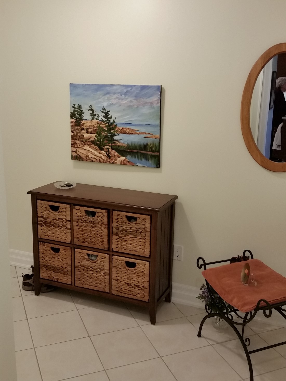
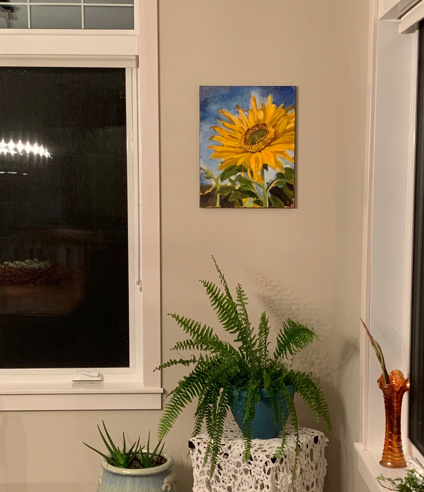
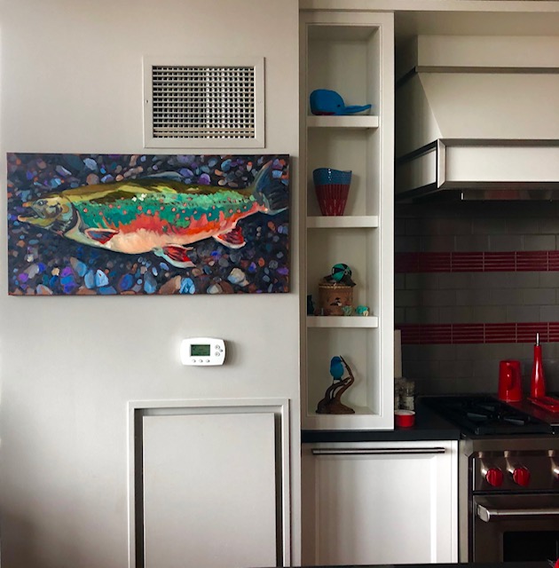
I have included client photos of their collections to see how you can vary and have fun with your displays.
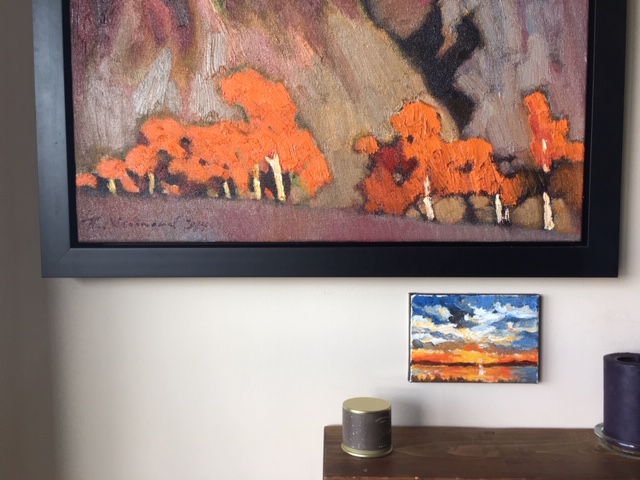
There are some basic guidelines, but they are meant to be adjusted according to the art and the space. Be free to variation for your specific needs.
One popular basic design guide prevents people from displaying work too high, a common mistake. This guide suggests displaying art 57 inches from floor level to centre of the work, which is the average human eye height.
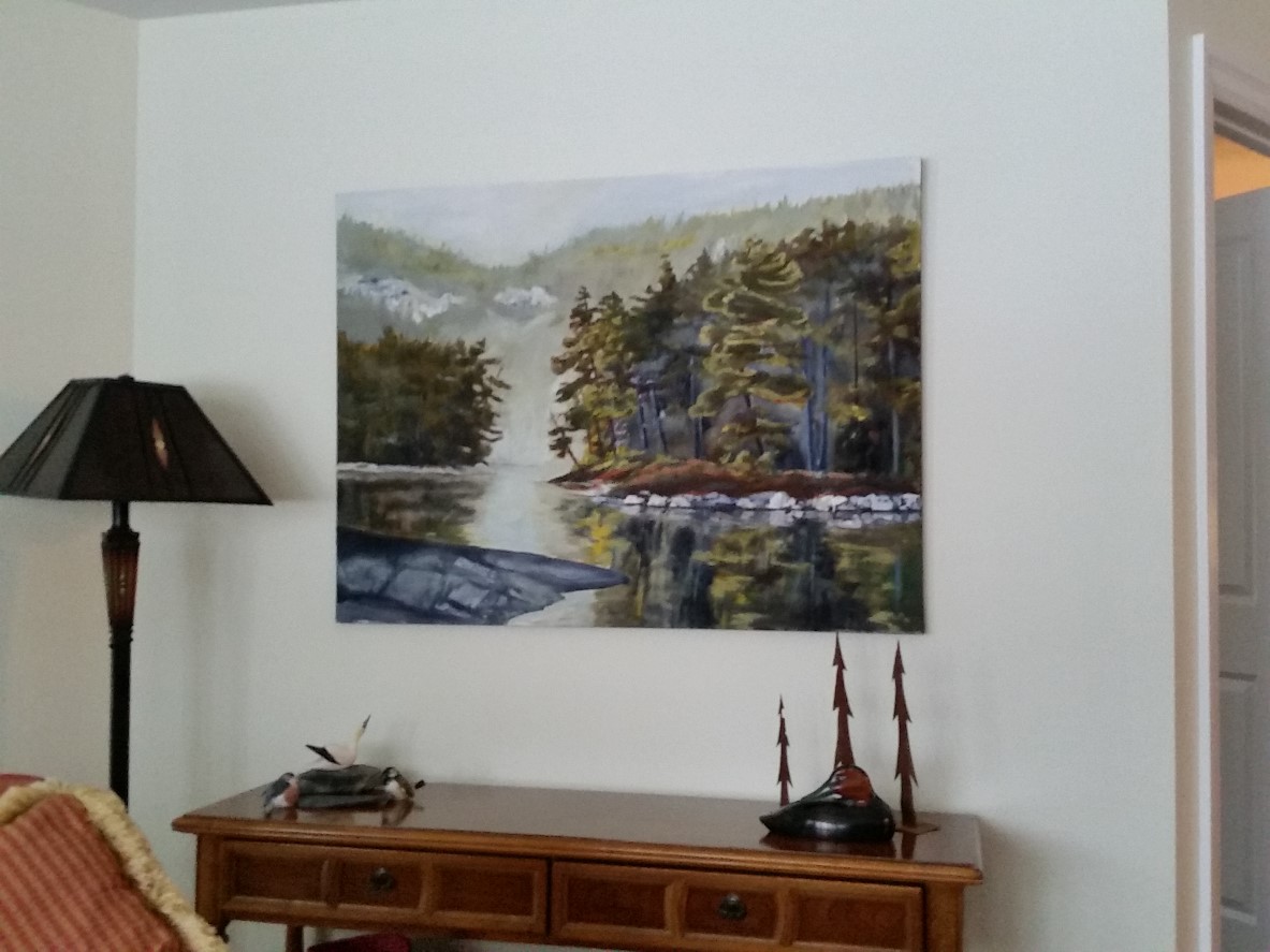
I have never applied this guide, instead, I focus on the art itself first, it’s composition, size, light it requires, and where it will most be viewed from. For example, from sitting height, standing, or passing by in a hallway.
Next, I consider the room, and what the art will be in ‘relationship to’, such as furnishings, windows, doorways, etc. Connection to these ‘relationships’ helps to bring cohesiveness to the room, and keep it from feeling stale or overly structured.
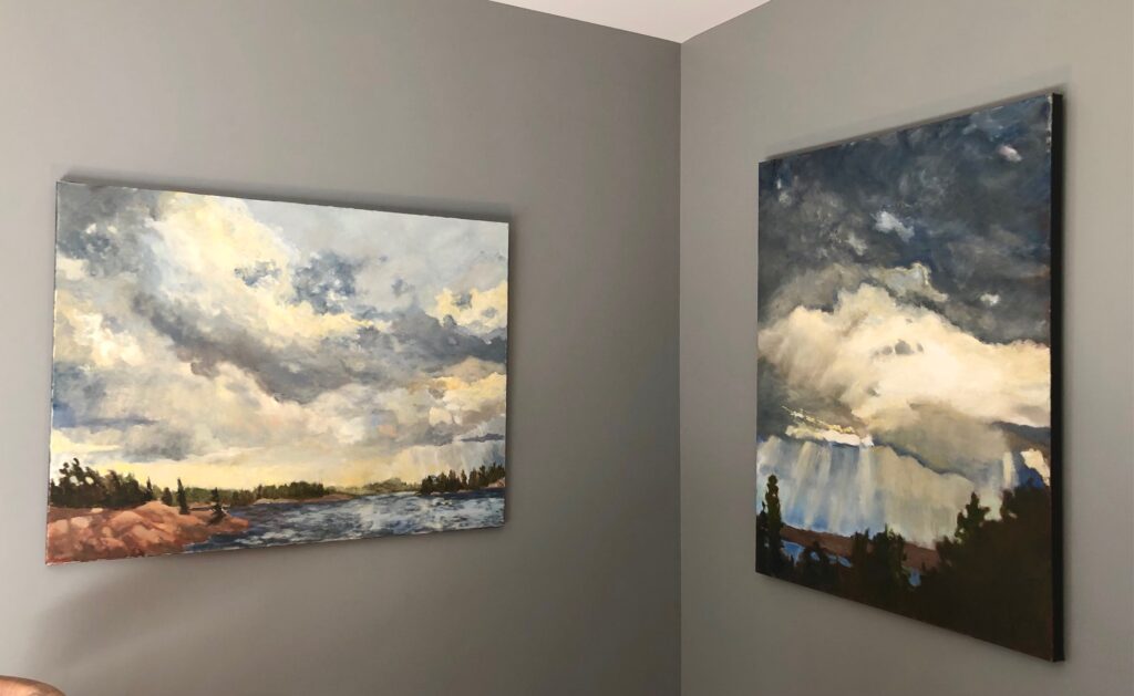
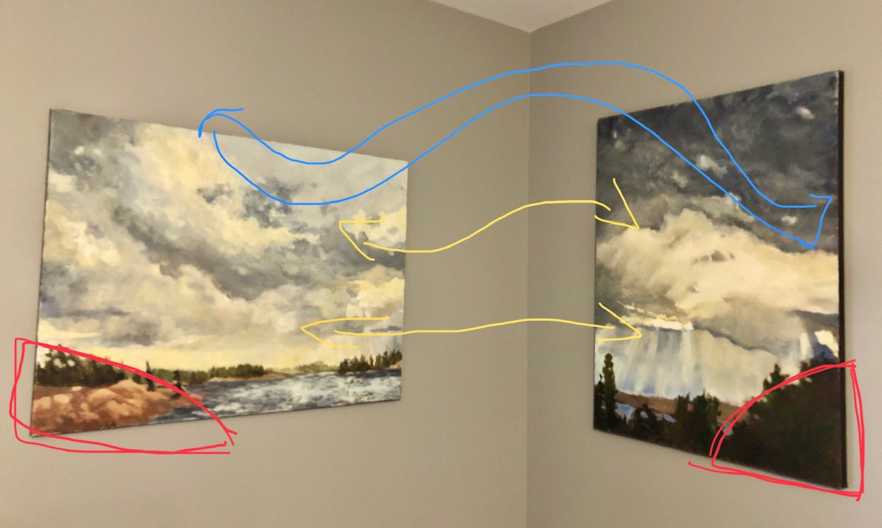
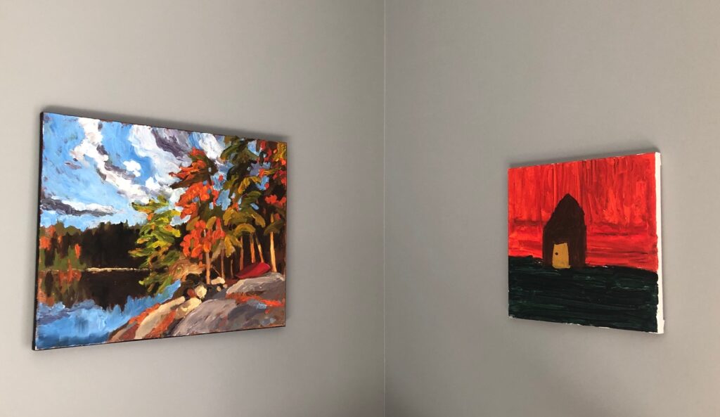
In an example below, I show how these two large paintings work together. Coloured lines show where the eye travels and how the sky ‘melds’. Normal rule dictation would indicate these paintings should be aligned either on the top or bottom of the pieces. This works better for ease of immersing into the work, and gives the a grounded feeling as you approach the work. Remember corners will give the illusion of unique perspective.
Another example, my work shown with Audrey Banning’s painting completed at age 4. I love this little vibrant painting of hers showing excellent colour and composition. These two paintings have cohesiveness because of colour similarity and human elements, the canoe in my painting, and the house in Audrey’s. The yellow line shows how I have adjusted heights to pair the horizon lines in each piece.
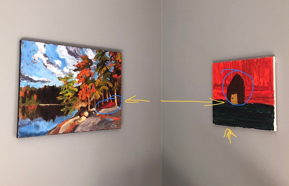
I haven’t placed them evenly on the bottom, or on the top of the panels, instead I considered the composition and the lines within each piece, where the eye would automatically go.
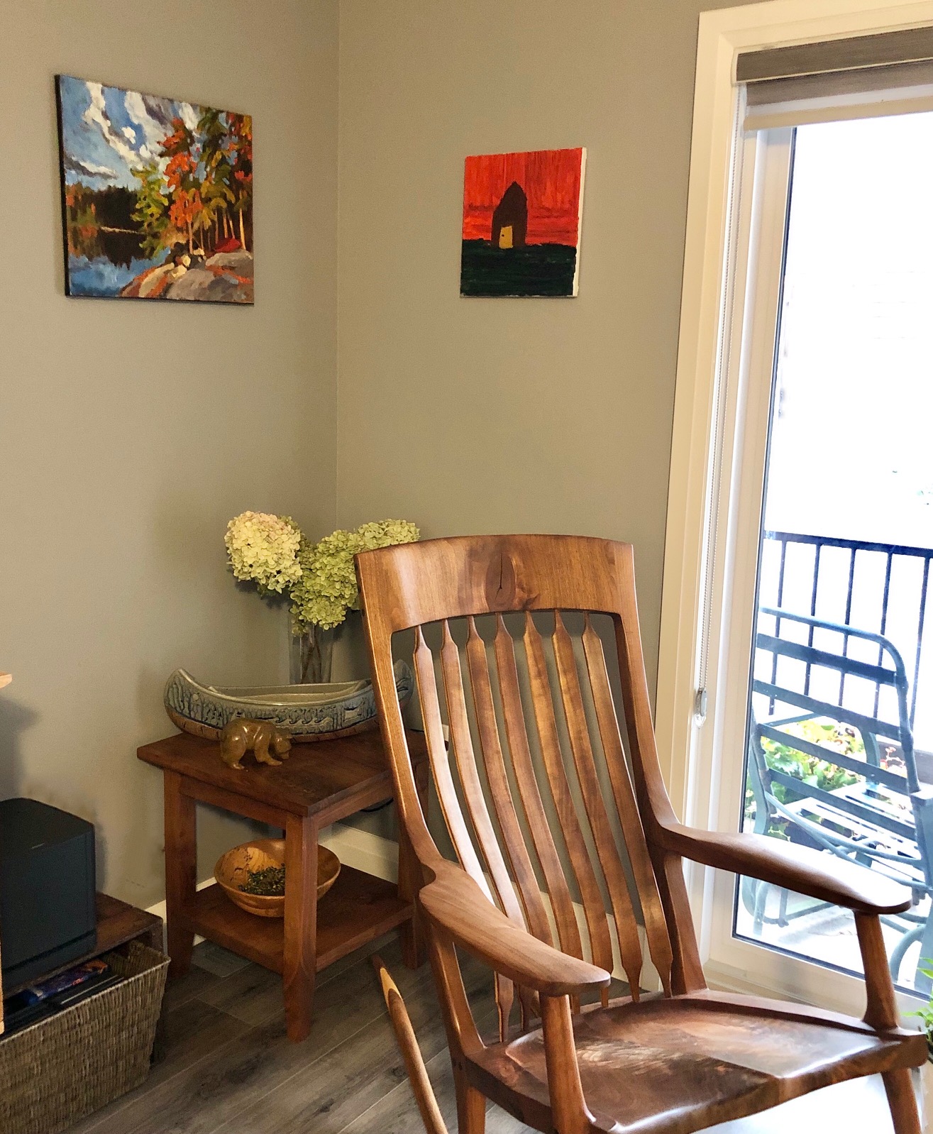
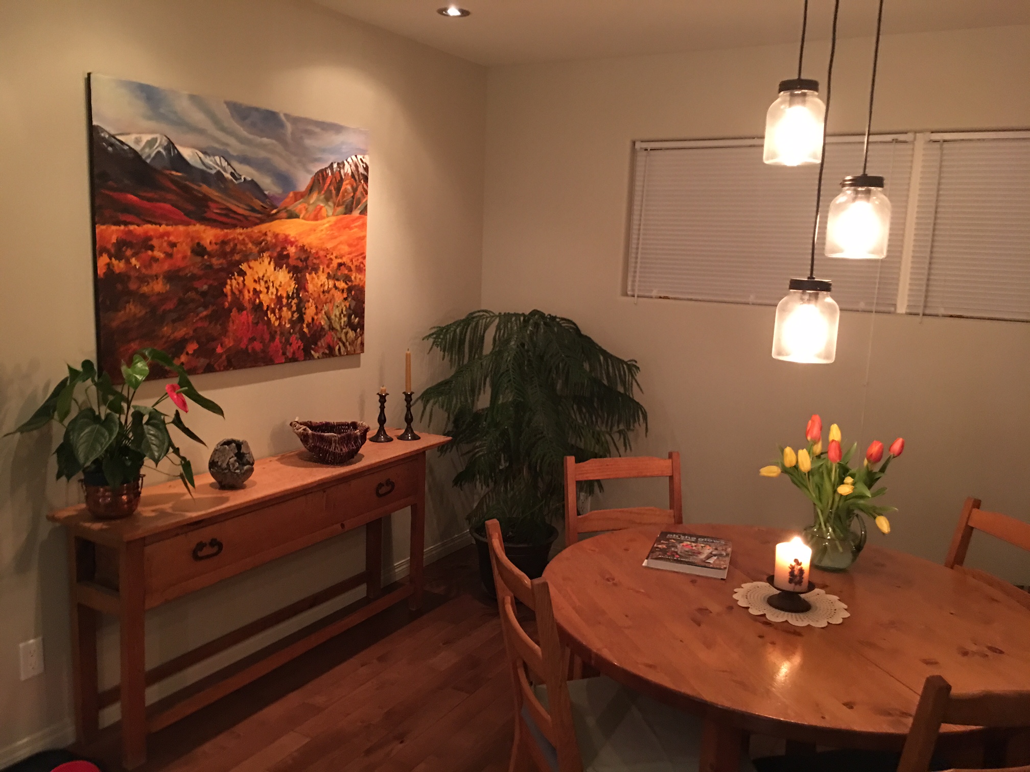
The wood elements of Marc’s furnishings bring a sense of the earth and anchors this corner display. Shown with Al Pace pottery, stone carving by Jim, bowl by Michael, make a lovely combination of handcraft and art.
Architectural digest conveys an excellent example of a multi collection that isn’t overbearing, and ideas on how to display unframed work. See the link here.
With your gathered knowledge you can orchestrate your experience with the art and how you engage with it in your spaces.
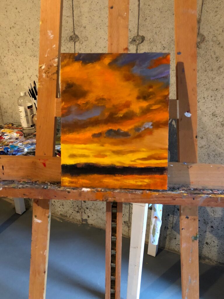
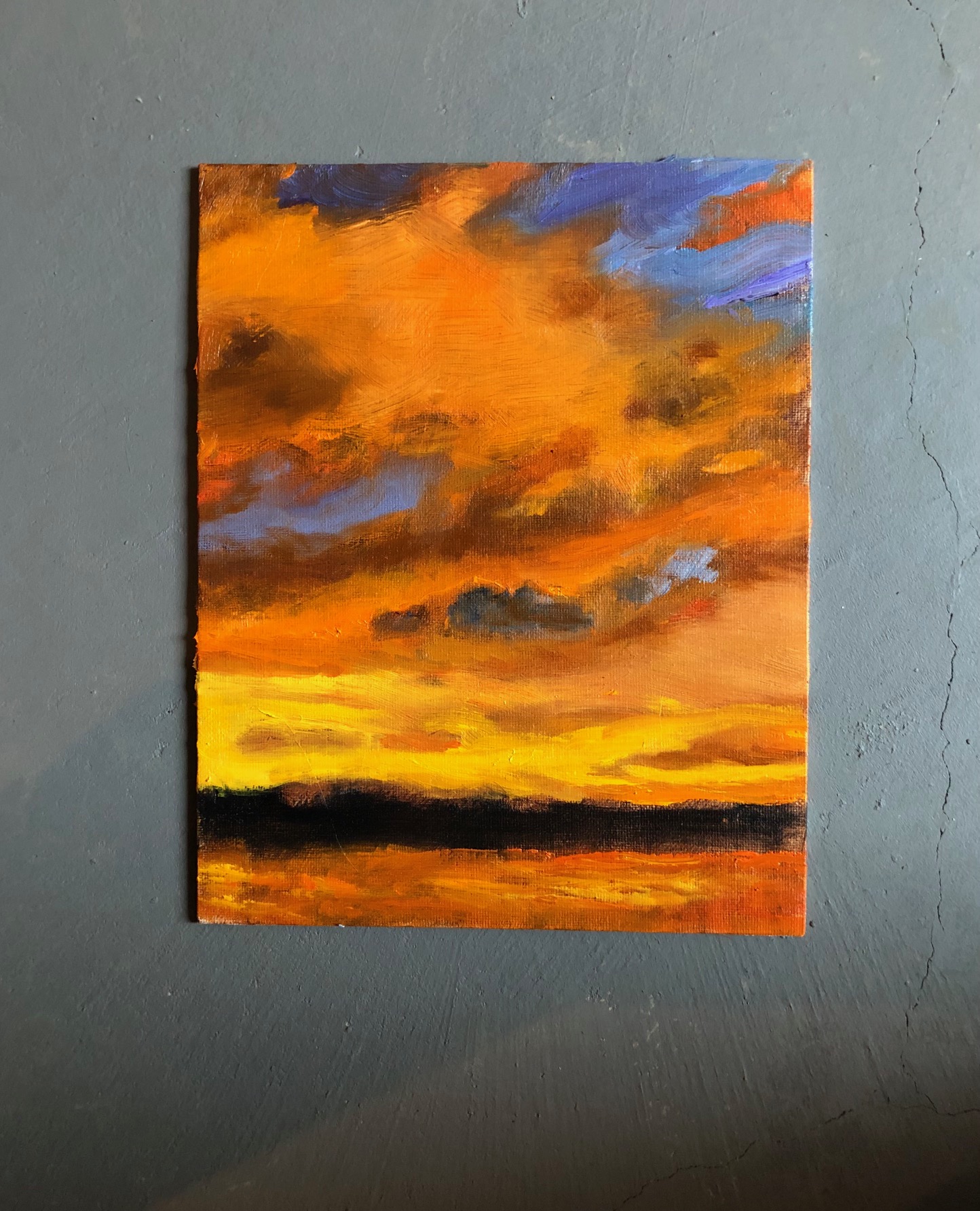
New on the easel below ~ Sunset 8×10 oil on board $550.oo